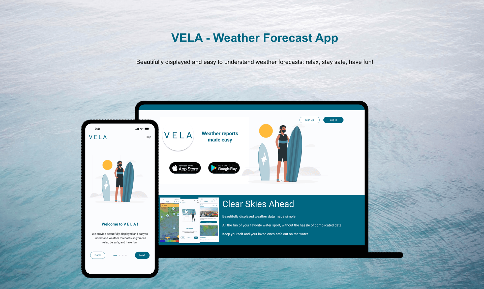
VELA - UX Case Study
“VELA provides beautifully displayed and easy to understand wind, wave and weather reports, forecasts and statistics for sailors, surfers, divers and any other water sport aficionados.”
 “Picture this: a stress-free day on the water, soaking in the joys of your favorite activities without a worry in the world. How were you able to pull that off? By checking the weather conditions near your chosen spot, of course! Yet, existing weather apps are often overwhelming with complex data, which can add frustration to an otherwise carefree day.
Enter VELA! We’ve reimagined weather reports, crafting them to be easily accessible and user-friendly. Our platform goes beyond forecasts, offering vibrant community hubs where water-sports enthusiasts converge, share insights, and communicate firsthand experiences. VELA ensures you’re armed with real-time, understandable weather updates, fostering safety and eliminating unnecessary stressors for you and your loved ones.”
Project Overview
My Role
- UX Researcher, UX Designer, UX Writer, UI Designer
Team
- Designer: Lucas Going
- Turor: Narine Hovhannisyan
- Mentor: Eda Utku
Tools
- Figma, Adobe XD, Marvel, Microsoft Excel
Duration
- 6 months
The Design Thinking Process
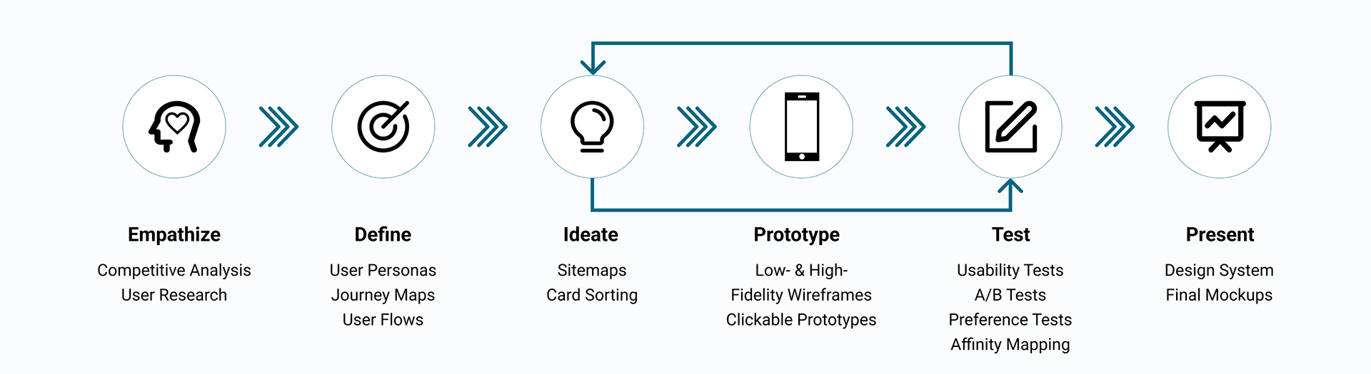
Empathize
I began to define a problem statement by conducting a competitive analysis. This gave me insight into how my competitors solve problems, as well as where potential holes in the market might be. I used the SWOT analysis methodology to identify the strengths and weaknesses of competitors.
Competitor Analysis
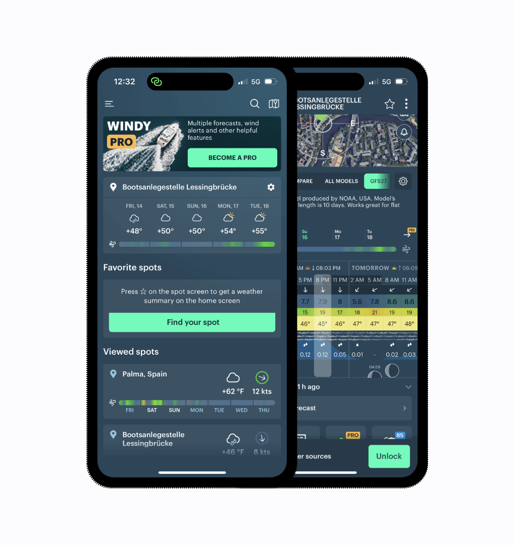
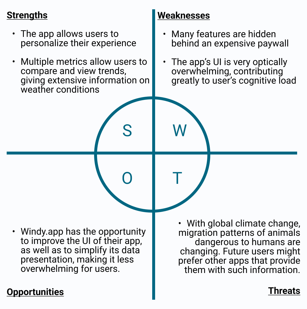
Key Takeaways:
- Competitor’s offerings are often hidden behind a paywall
- Many competitor’s apps are overwhelming
User Research
In order to gain a better understanding of the needs and behaviors of VELA’s users, I decided to conduct user interviews. Information gathered from user research is important in keeping a user-centered design focus, and influences all future design decisions.
Interviews
- Remote Interviews, Three Participants, Aged mid 20s - early 30s
Research Goals
- Understand the current methods and sources that water-sports enthusiasts use to check wind and weather conditions
- Identify the specific challenges and pain points users face when trying to access wind and weather information for water-based activities
- Determine the frequency and context in which users need to check wind and weather conditions.
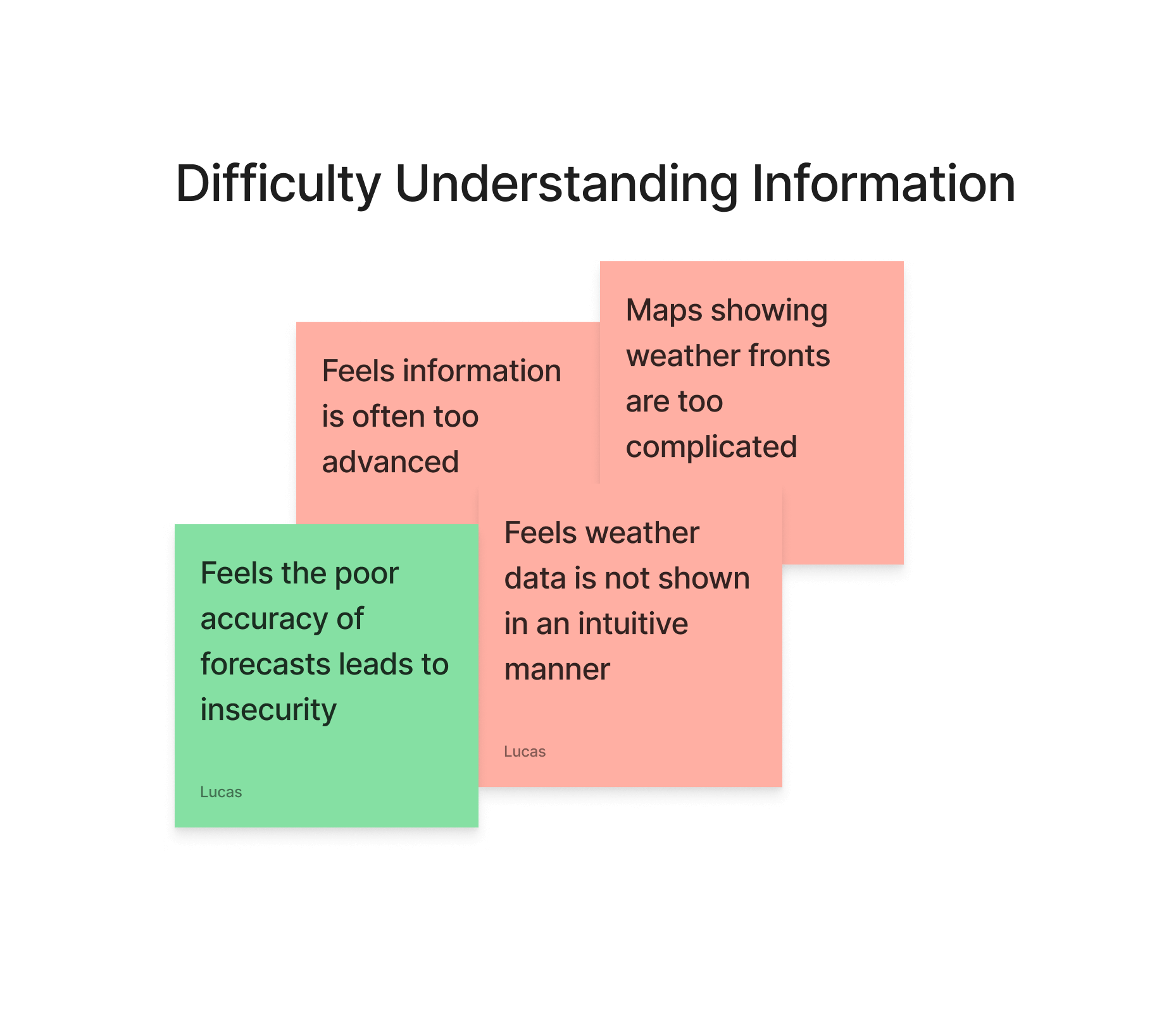
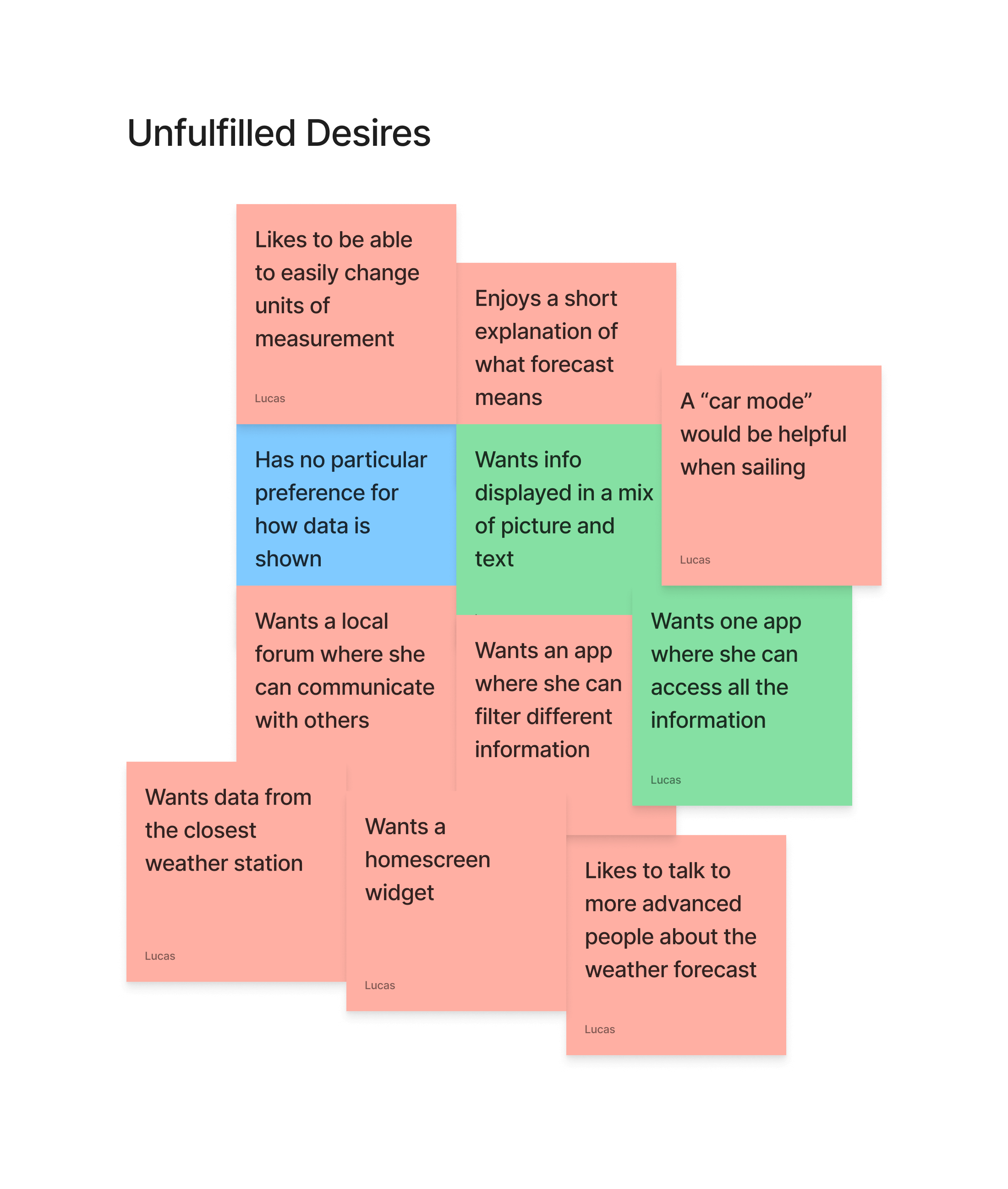
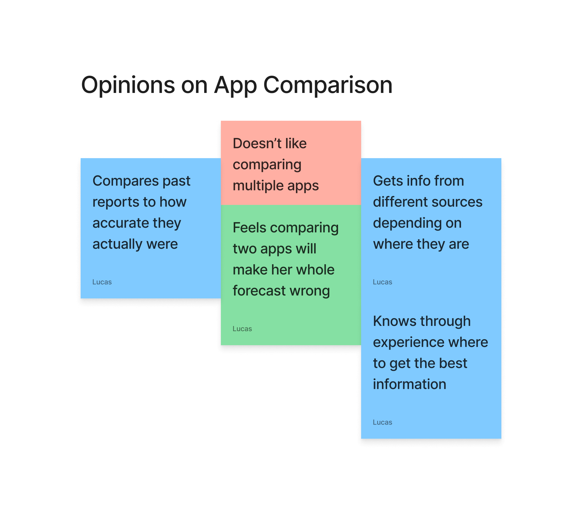
Interview Analysis
After conducting user interviews, I was able to categorize data points into several different categories, which allowed me to better see how my users behave, as well as where there may be potential pain-points.
Key Takeaways:
- Participants often check multiple sources.
- They often feel data is presented in a confusing manner.
- When users are confused, they begin to doubt the accuracy of weather reports.
This tells me that VELA users will want a reliable source of information which is presented in a simple, easy-to-understand way.
Define
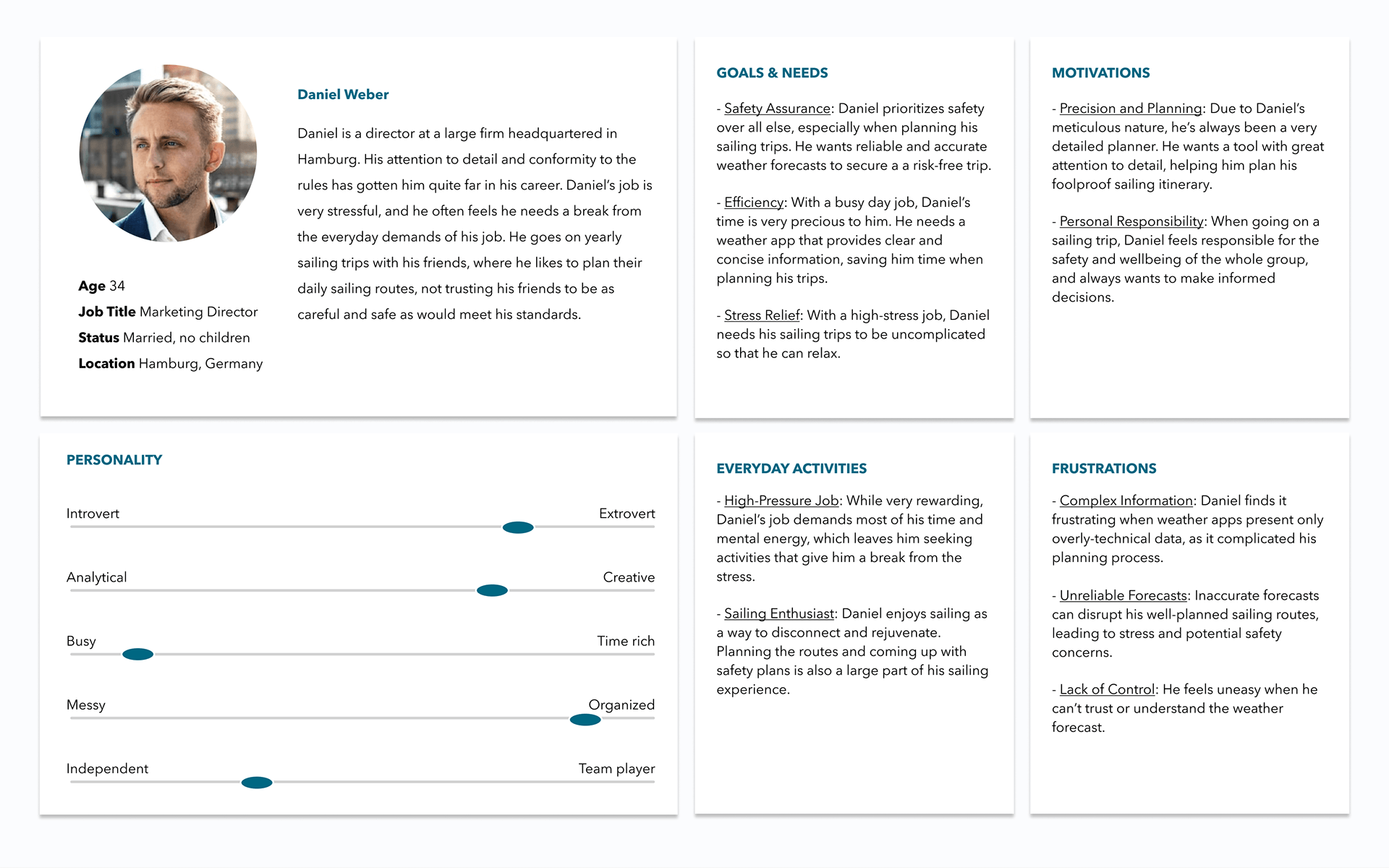
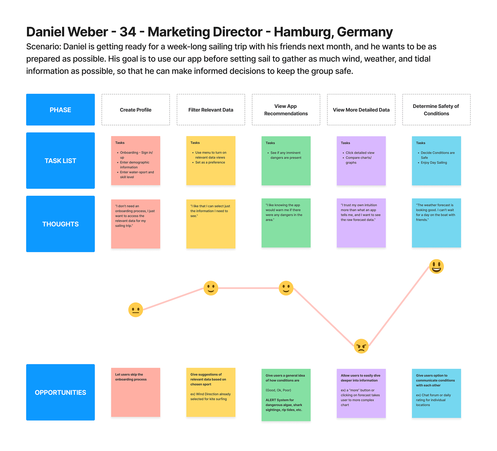
User Personas & Journey Maps
Data analysis from my user interviews led me to developing two user personas, one of which will be highlighted here. These user personas and corresponding journey maps reflect the goals and behaviors of my target audience, allowing me to keep their perspective in focus as I move forward with VELA’s design.
User Flows
Using user stories as a roadmap and defining success criteria, I began to develop user flows to simplify the app’s basic functionality. Focusing on the ‘happiest path”, my goal was to design a seamless experience from point A to point B.
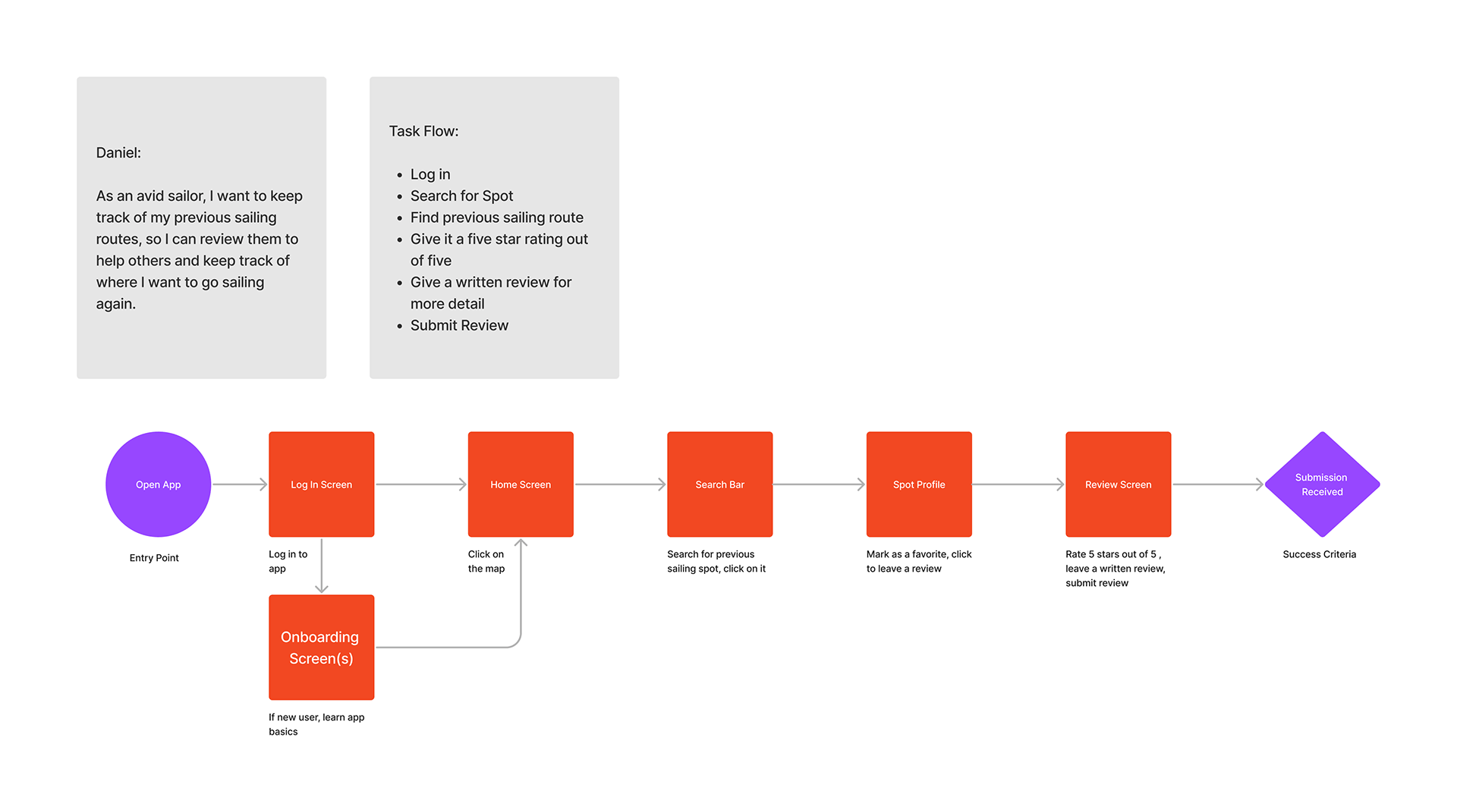
By outlining essential tasks and creating user flows based on personas, I was able to establish the foundation for the app’s information structure. This process enabled me to refine my focus, ensuring a manageable scope that aligned with the project timeline.
Ideate
Cardsorting & Sitemap
A preliminary sitemap was developed using the user flows as reference. A card sort was then conducted, in order to better understand the user’s behaviors and understandings of where they expect to find specific information.
After running the collected data through a similarity matrix, several initial assumptions were confirmed about the app’s information architecture, and only slight changes were made to consolidate some pages and add a few additional ones.
Initial Sitemap
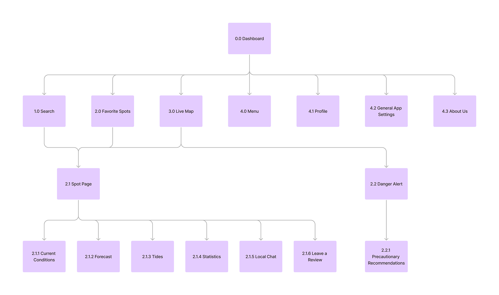
Updated Sitemap
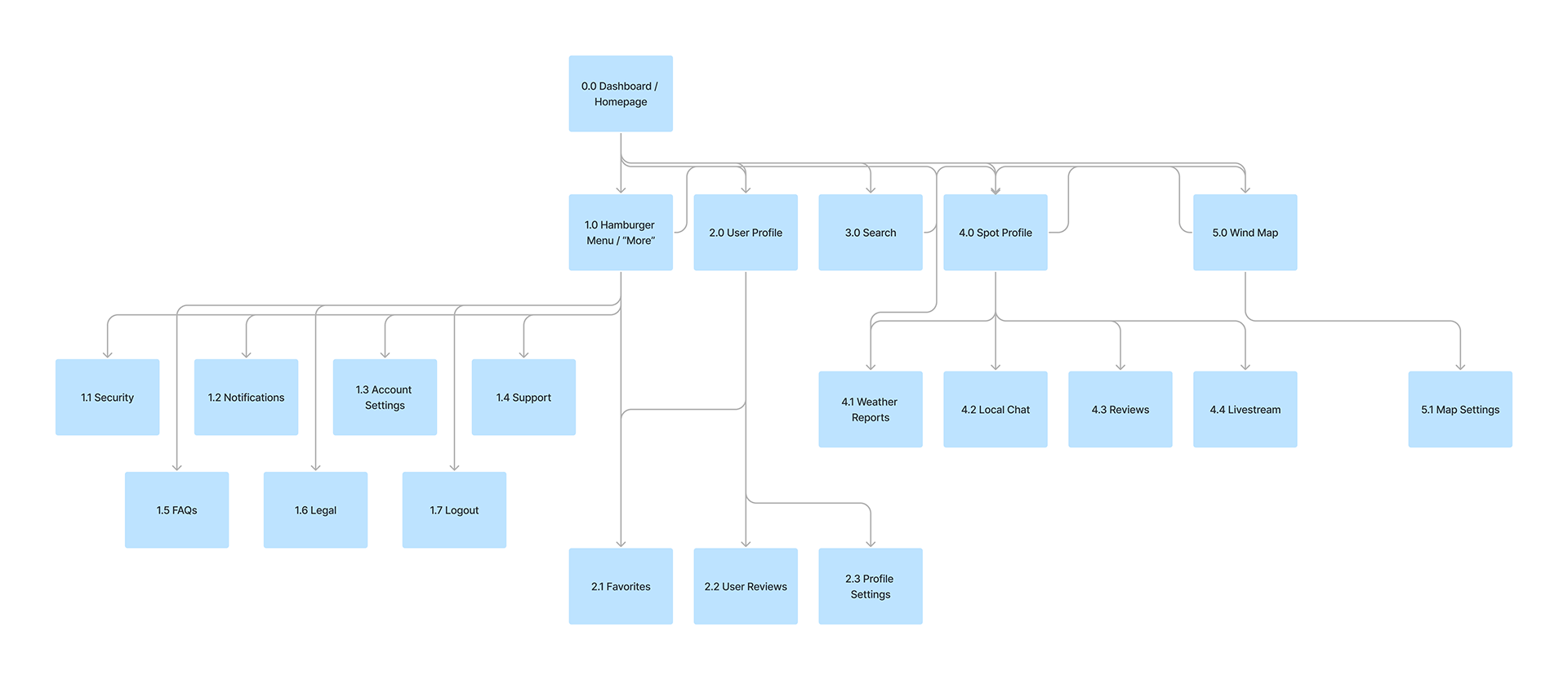
Key Takeaways:
- Information related to weather forecasts should all be located on the same page.
- Community functions should all be located under the “spot profile” page.
- Danger alerts should appear, when necessary, as an overlay on other pages, and do not need their own separate page.
Now that user flows had been defined, and categories had been validated through user testing, it was time to begin the wireframing process.
Prototype
Initial Wireframes
I created initial low-fidelity wireframe sketches based on what learned from my initial research, and improved upon them until I had a high-fidelity iteration of my design. I used these wireframes to develop a clickable prototype, which I then used for usability testing.
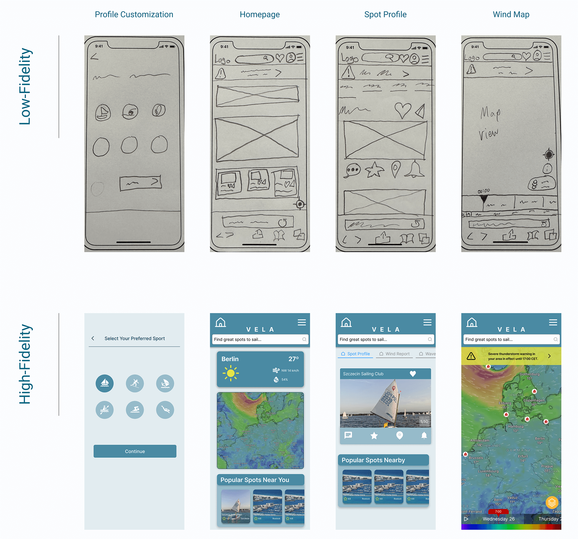
With my clickable prototype developed in Figma, I organized five participants to complete direct- and scenario-based tasks, testing the usability and efficiency of my user flows.
Test
Usability Testing
Participants
- Total: 5
- Age Range: 25-35
- Background: Diverse backgrounds, including preferred water sport
Methodology
- Moderated in-person testing
- Moderated remote testing
Goals
- Assess the learnability for new users interacting with VELA
- Observe and measure if users understand the application and its value
- Test if users can complete basic functions such as logging in, checking the weather, and searching for a desired spot
Test Objectives
- Determine if participants understand what the app is about quickly and easily (i.e. an application for checking wind, wave, and weather forecasts) and the value it provides.
- Observe how users navigate the application and find weather information from the homepage. Are they able to find what they are looking for?
- Understand how the users interact with the spot profile pages. Is this a feature they desire, or does it add unnecessary confusion?
Results & Analysis
I used an affinity map to sort out data collected from the usability tests into actionable categories, allowing me to identify trends in the data. Then, using a rainbow spreadsheet in combination with Nielsen’s severity scale, I was able to effectively prioritize my prototype’s usability issues. This guided me towards which design changes were of the utmost importance, and which could be fixed at a later date.
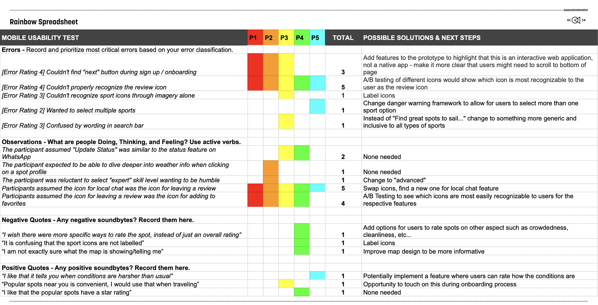
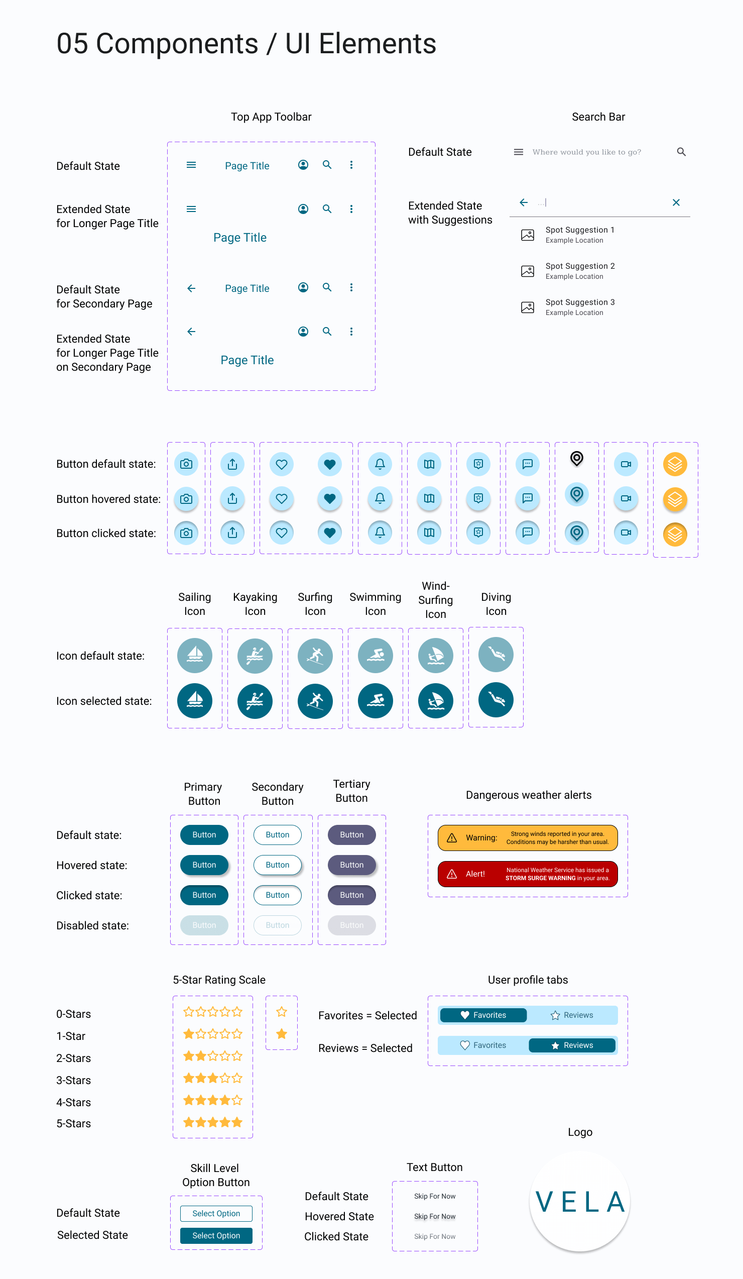
Reflecting on this round of usability testing, it is now clear to me that I should have spent less time worrying about the UI of my high-fidelity wireframes. A full-fledged color scheme was not only unnecessary at this stage of the design process, but I would also argue that it was both a waste of time, and distracting when it came to making necessary changes. Luckily, there were not any usability issues detected that would have required a complete design overhaul. The major issues were that users were confused by the meaning of certain icons, or were not able to locate the CTA button on certain screens.
Top 5 Usability Improvements:
- Review icon was changed to make it recognizable to users
- Local chat icon was changed to help distinguish it from the review icon
- Redesign of the onboarding process to be put through preference testing
- Suggestive text in search bar optimized to be more inclusive
- “Expert” skill level option was changed to “advanced” to sound less boastful
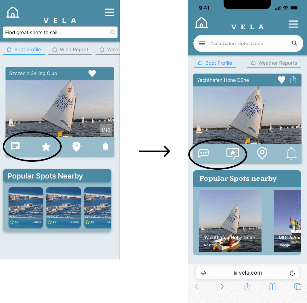
Improvements 1 & 2:
Due to initial lack of clarity, the “local chat” icon and the “reviews” icon were both replaced, in an attempt to make their functionality clearer. This would require more testing to confirm if this increases usability or not.
Preference Test
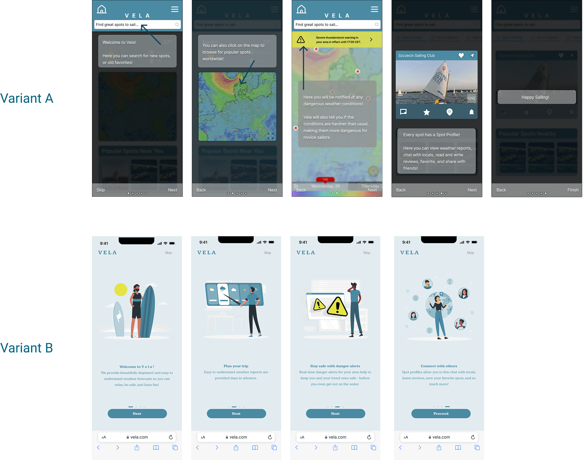
A preference test was conducted between the two onboarding sequences to see which style was preferred by the app’s target users. The test had 13 participants, 4 of which voted for variant A, with 9 voting for variant B. This difference was 95% likely to be statistically significant, which was was enough for me to be confident that this style was actually preferred over the other.
Designing for Accessibility
After a round of peer feedback and reviewing the Web Content Accessibility Guidelines (WCAG), changes were made to the app’s design to promote inclusivity to all users, regardless of disability, and to give this design iteration a more polished look.
Accessibility Issues
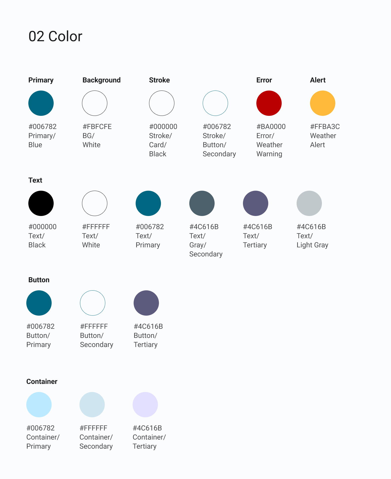
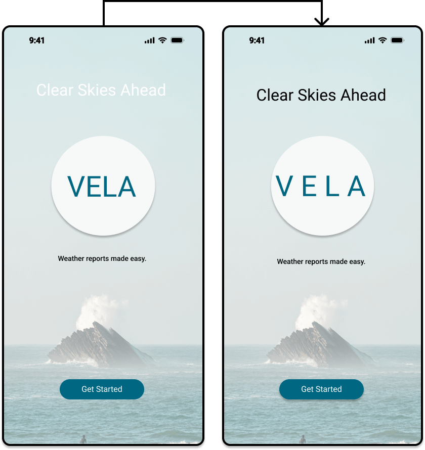 Color contrasts between text and background color were adjusted to meet the WCAG’s recommended contrast ratio of 4.5:1.
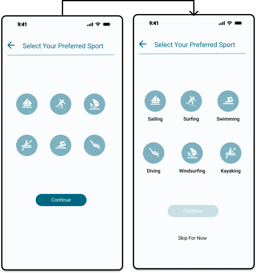 Icons were properly labelled so they could be recognized by screen reading softwares. This benefits all users, as it removes any potential confusion behind the meaning of icons.
Present
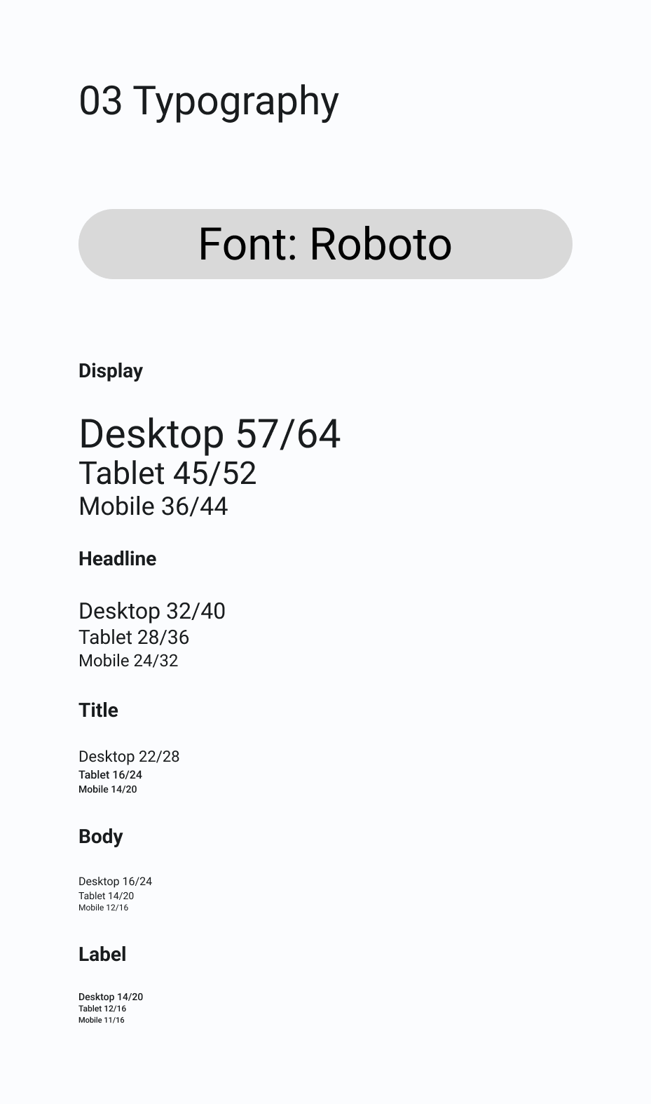
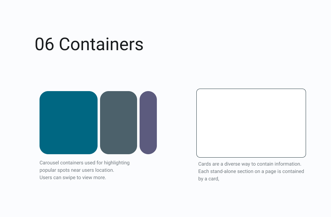
Following design principles and Gestalt psychology, I developed a design system which would be useful to any other designer working on this project. This sets a clear standard of the app’s elements, and allows for consistency and collaboration in future iterations of the app’s design.
Design System
![]()
Clickable Prototype
Challenges & What I Learned
Gaining a deep understanding of the wants and needs of your users is difficult, and requires a level of empathy that can only be acquired through rigorous, continued testing, and an ability to see from someone else’s perspective.
After gathering a further understanding of the users needs and expectations, it became then an added challenge of balancing them with business goals, which is a crucial element to the success of a project.
I found the VELA project slightly overwhelming at times, as I have no personal experience with any sort of water sports outside of swimming, which was quite a large barrier to entry for me while designing for this project. In the future, I will be more hesitant to take on such projects, especially if I am the sole designer for them.
This project has also shown me how difficult it is to be the only designer on a project in general. The collaboration that comes from working with a team of designers, developers, and project managers is a valuable asset, and I now understand just how important it is to have this wealth of knowledge that comes from these different perspectives. If I had been working in a team, I would have felt less pressure, as well as been more secure in my design decisions, having others there to constantly give me feedback and recommendations.