Voqab - A UX Case Study
Project Overview
Role
UX Designer
Duration
1 month - March 2023
Background
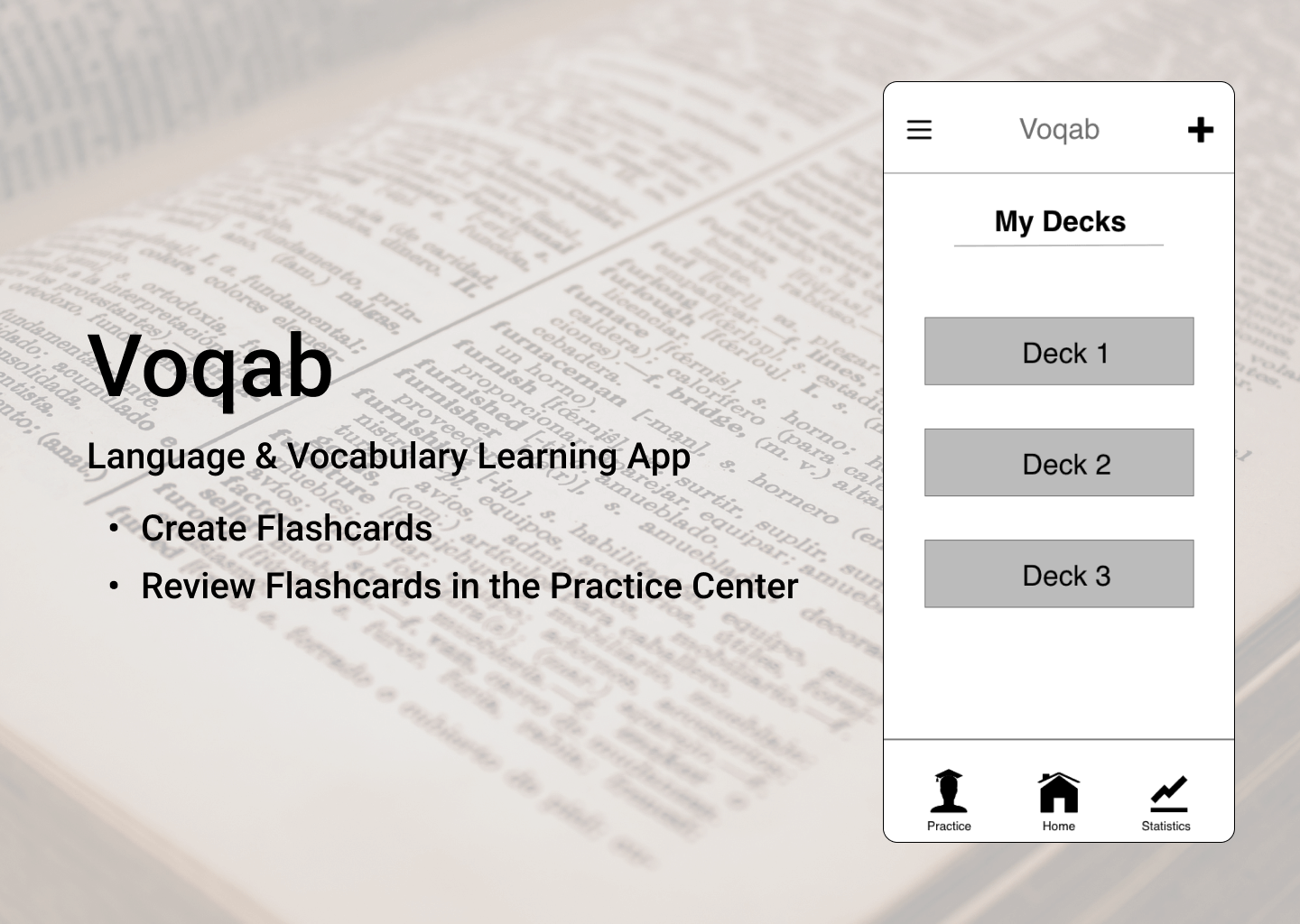
Voqab is the first design project I created as part of my Intro to UX Design course with CareerFoundry. Following the steps of the design thinking process, I created a low-fidelity prototype which was tested on potential users to find how the design could be improved.
Tools
Pen and Paper Adobe XD Figma
Competitive Analysis
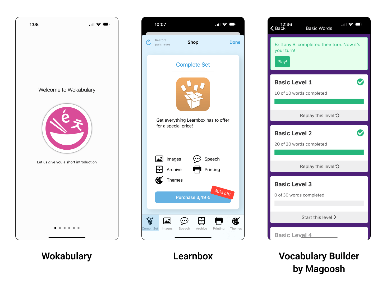
To start off the project, I analyzed 3 vocabulary apps to get a better understanding of the market.
Wokabulary
Wokabulary has a simple, easy to navigate onboarding process, which clearly shows the user how to use the app, as well as what makes is special. The app is easy to use, and is clearly designed for language learners.
Unfortunately, virtually all features (including having more than 30 cards) are locked behind a paywall, which is likely discouraging to many users.
Learnbox
Learnbox is easy to use, and focuses highly on users practicing using flashcards of their own creation.
I found the option to name each individual flashcard confusing (it’s not explained during onboarding). I think a better feature would be to add tags to sort cards into different categories.
A lot of the app’s best features are free to use, meaning users can get quite a lot of value from the app without having to pay any money.
Vocabulary Builder by Magoosh
Learnbox is easy to use, and focuses highly on users practicing using flashcards of their own creation.
I found the option to name each individual flashcard confusing (it’s not explained during onboarding). I think a better feature would be to add tags to sort cards into different categories.
A lot of the app’s best features are free to use, meaning users can get quite a lot of value from the app without having to pay any money.
Main Takeaway
A competitive analysis helped me gain a better understanding of why users choose specific vocabulary apps, as well as the educational context in which they’re used.
User Research
I interviewed 4 participants to gain a better understanding of what kind of vocabulary learning app they would find both useful and enjoyable.
Interview Questions
- Tell me about your current occupation. What does your daily routine look like?
- When was the last time you studied new vocabulary? What was your motivation for studying?
- How often do you study new vocabulary? How long do you typically study for?
- What tools do/did you use to study new vocabulary?
- What is your opinion on these tools?
- Which features of these tools do you find helpful? Which features do you find unhelpful?
Interview Analysis
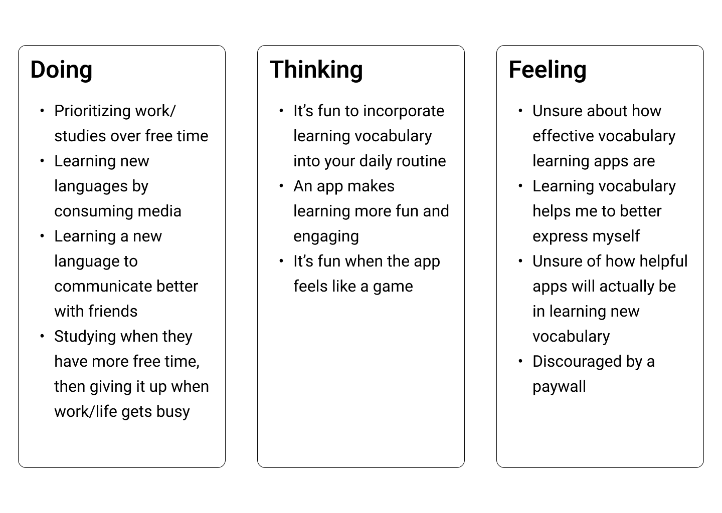
After reviewing my notes and audio recordings of the user interviews, I categorized their comments into the categories ‘doing,’ ‘thinking,’ and ‘feeling.’
Main Takeaway
My interview participants want an app that is fun and engaging, while being easy to incorporate into their everyday lives.
Understanding the Problem
Proto-Persona
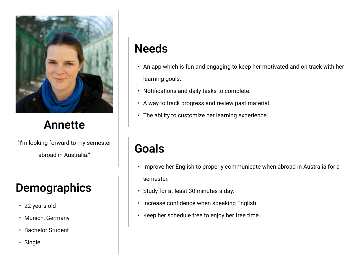
I took key insights from my user research and competitive analysis, and combined them to create a proto-persona. I was then able to use this persona to drive my design decisions throughout the rest of this project.
User Stories
- As a student, I don’t have a lot of extra time to study new subjects. I need to be able to do quick exercises whenever my schedule frees up.
- As a student, I need access to past exercises so I can review.
- As a traveler, I don’t always have access to the internet, and need to be able to study in offline mode.
- As a student, I want to be able to customize my exercises to make them more relevant to my studies.
- As an app user, I want push notifications to remind me to complete my daily tasks.
Problem Statement
Annette needs a way to improve her English in preparation for her study abroad program, because she will need to be capable of completing her courses in the foreign language. We will know this to be true when we see that she is comfortable completing coursework for her studies in English.
Hypothesis Statement
I believe that creating a mobile language learning app with customizable daily tasks, flashcards, and insight into culture in countries where the target language is spoken, Anette will achieve her goal of improving her English for her study abroad program.
Information Architecture
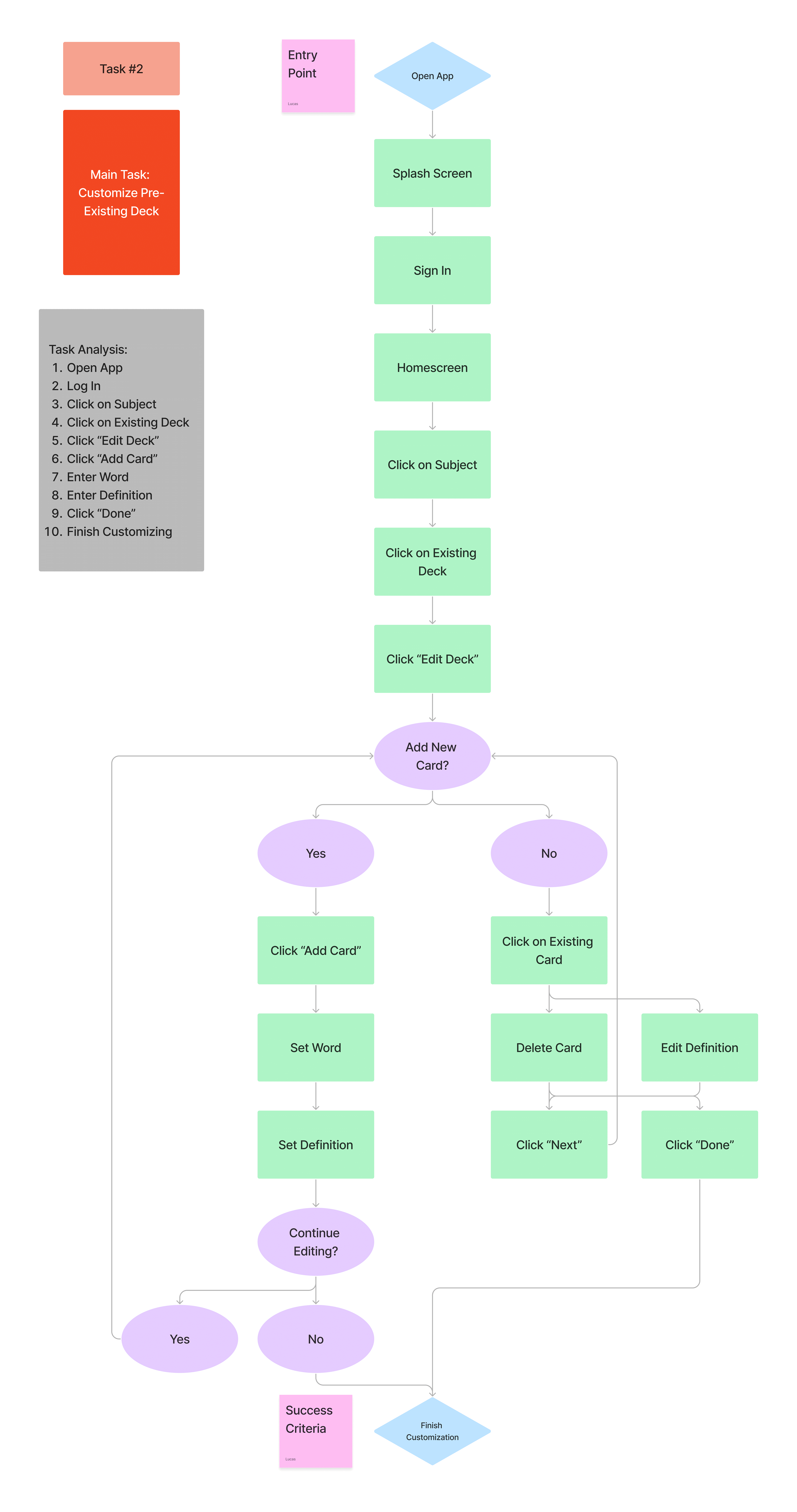
I came up with several tasks and task analyses, keeping in mind what Annette’s needs and goals are. This helped me to come up with initial user flows for different app features.
Wireframing & Prototyping
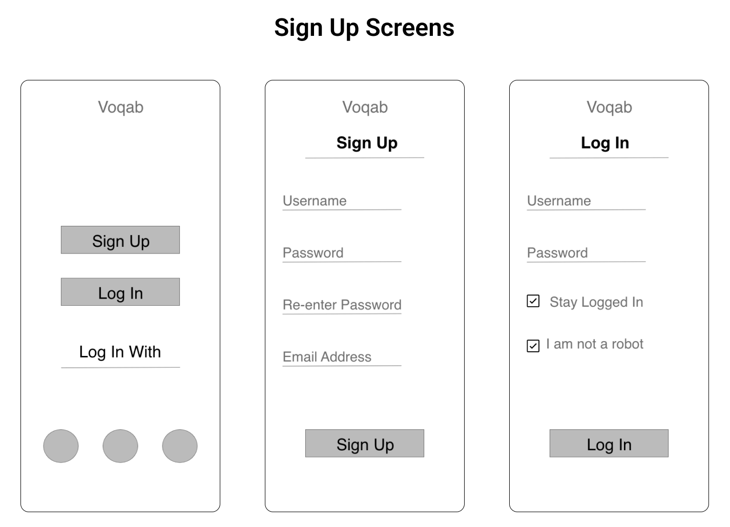
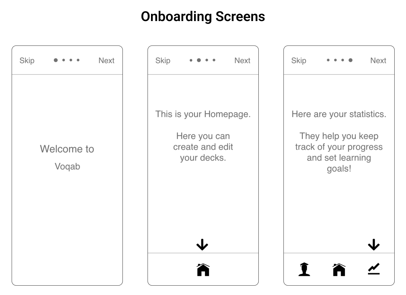
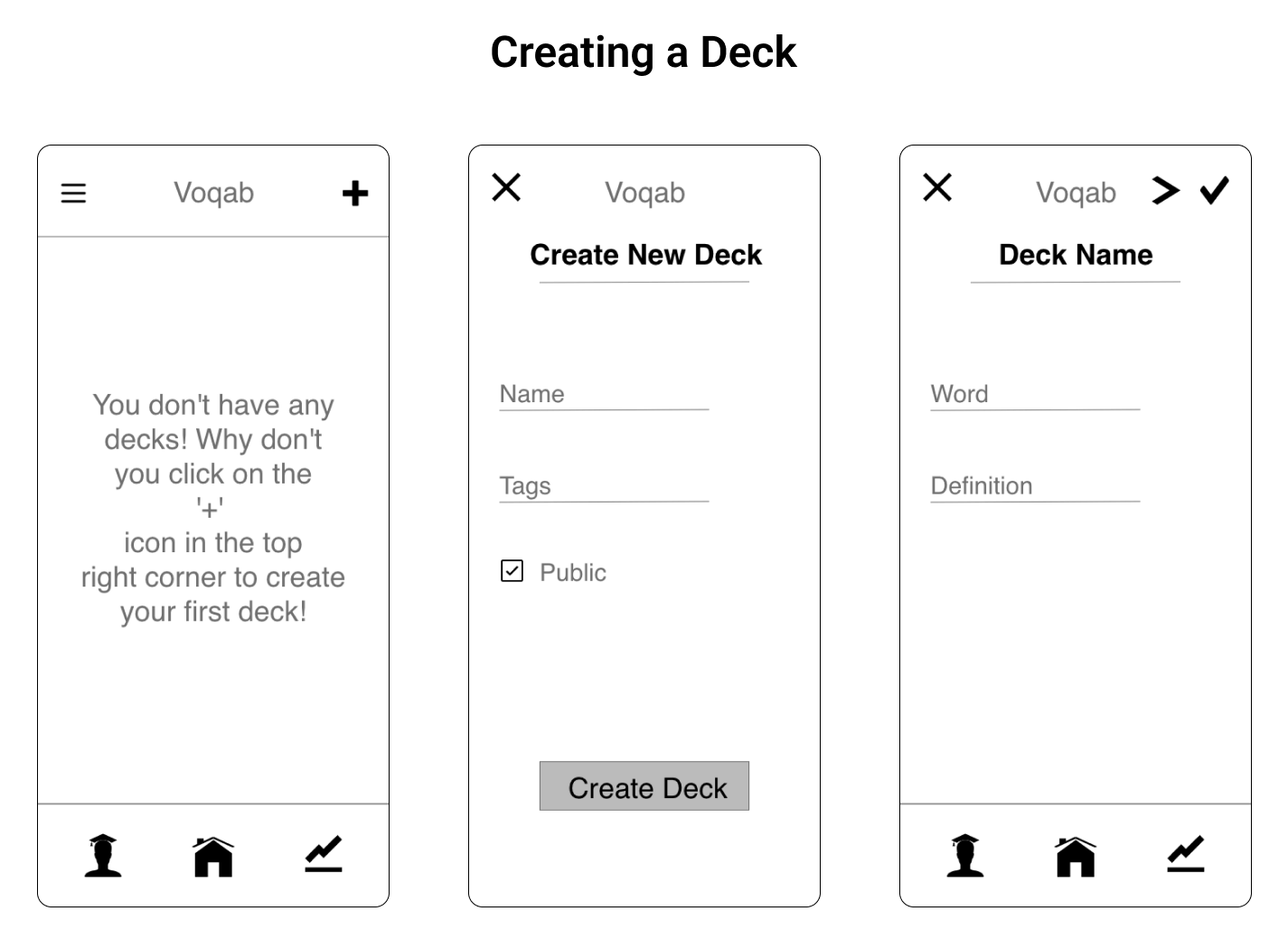
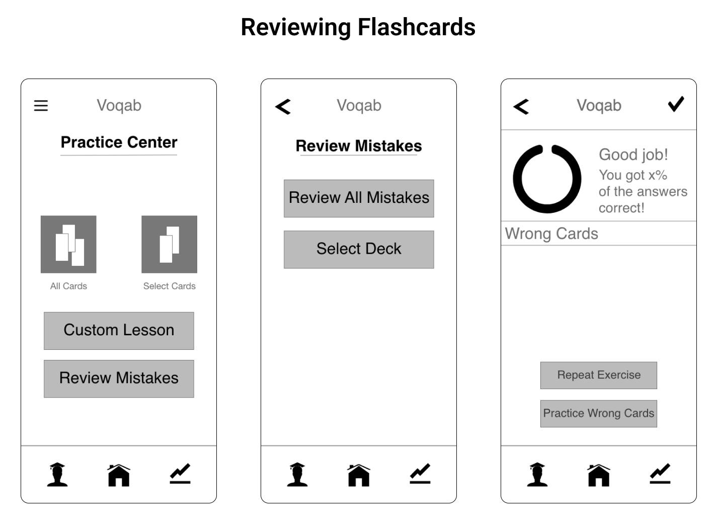
After some bare-bones sketches on paper, I digitalized my low-fidelity wireframes in Adobe XD, where I was also able to create a clickable prototype, which I would then use in my usability tests.
Usability Testing
Scope
The first prototype of Voqab, a vocabulary learning app, was tested.
Schedule
In-person moderated usability tests were conducted on March 12, 2023.
Session
A total of 3 participants took part in the tests, individually, for a total of roughly 10 minuted per session.
Equipment
Participants were provided an iPad to complete the test on. I used my personal cell phone to take an audio recording of each session, with participants’ consent.
I asked the participants to complete 4 scenario tasks. My goal was to observe how easily they navigated through my prototype, and identify any usability issues along the way.
Scenario Tasks
- Imagine you are taking an advanced course on a foreign language. You have a decent grasp on the language, but need to learn a lot of vocabulary to keep up with what is expected of you in the course. In order to personalize your learning experience, you want to create a deck of flashcards with the most important vocabulary words.
- You’re about to spend a semester abroad in Australia. While your English is good, you know that you’re going to need to improve your language skills to complete your coursework, and you want to better communicate with the locals. You’ll want to review your deck of flashcards you just created.
- You’ve been studying your own flashcards for a while, and although you have memorized most of the cards, you continue to get the same ones wrong over and over again. Voqab compiles flashcards marked as incomplete, and allows users to review only those cards.
- You’re a student with a part-time job, and you want to spend what little free time you do have enjoying yourself. However, it’s really important to you that you study every day, and you need help staying on track. In order to do this, you can decide how long you want to study per day, and get notified daily to complete your goal.
Test Report
[Test Report] I categorized my observations of participant’s behavior based on the tasak that was asked of them, and gave them a severity rating based on Jakob Nielsen’s scale. I then came up with recommendations on how to fix these usability issues.
Prototype Improvements
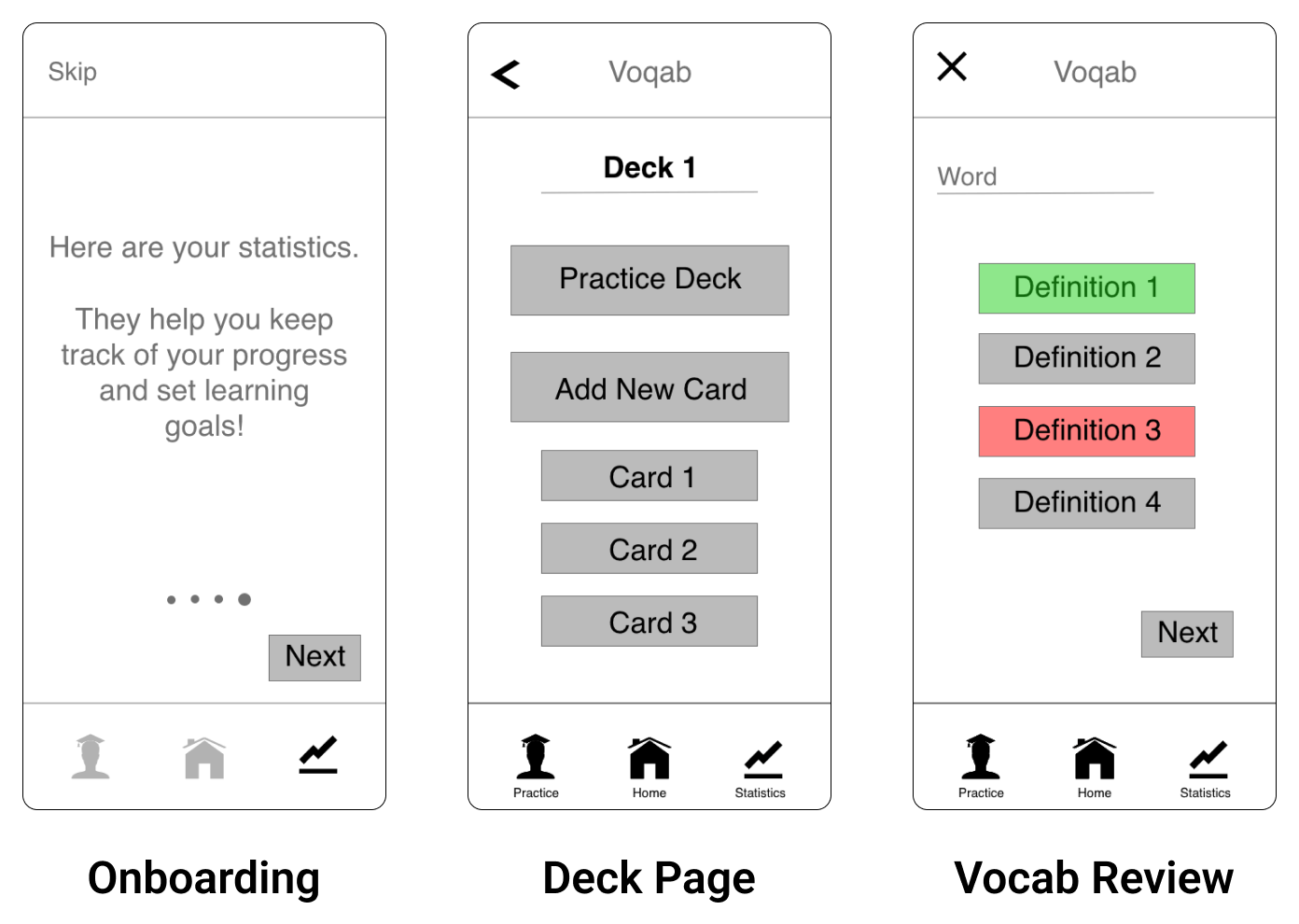
Onboarding progress indicator moved to bottom for clarity. Next button moved for better accessibility. Previously introduced icons are transparent to highlight which icon is being introduces.
Option to practice has been added to the deck page, giving users multiple ways to access their reviewing exercises.
Correct answer also shown in green during review when user gets an answer wrong.
Concluding Thoughts
Future Iterations
The next step I will take in this project is creating a high-fidelity prototype, and conduct further usability testing. I will design a reward system that encourages users to continue coming back to review, and I will also submit that to usability testing. I will design a feature that allows users to upload photos with their flashcards.
Main Takeaway
Working on Voqab, my first UX project, I learned just how valuable a user-centered design process is. Through conducting user interviews and usability testing, I gained a better understanding of my user, and was able to look through their perspective while working on my design.